
Documentation
Rides, maps and sharing
What gets recorded, what the charts show, and how to get the data back out.
While the wheel is connected and you are moving, the app writes the ride into your phone's storage. None of it leaves the device.
Replay and sync on Android#
On a ride’s detail screen, Ride report and Replay ride share one block below the map. Replay shows the recorded readings on the dashboard; going back returns to the same ride.
Enable sync separately under Menu → Account. During sync, the app shows the current stage, ride number, file transfer size and when it is waiting for server confirmation. Unknown totals show the current stage without invented percentages. Errors explain the reason and offer a retry; rides already transferred do not need uploading again.
Large rides are processed on the server in the background. Android and iOS show whether a ride is queued, processing or being retried; validation shows the actual number of records processed. A ride is acknowledged as saved in the account only after processing finishes. If the app closes or connectivity drops, retrying sync checks the task already accepted by the server.
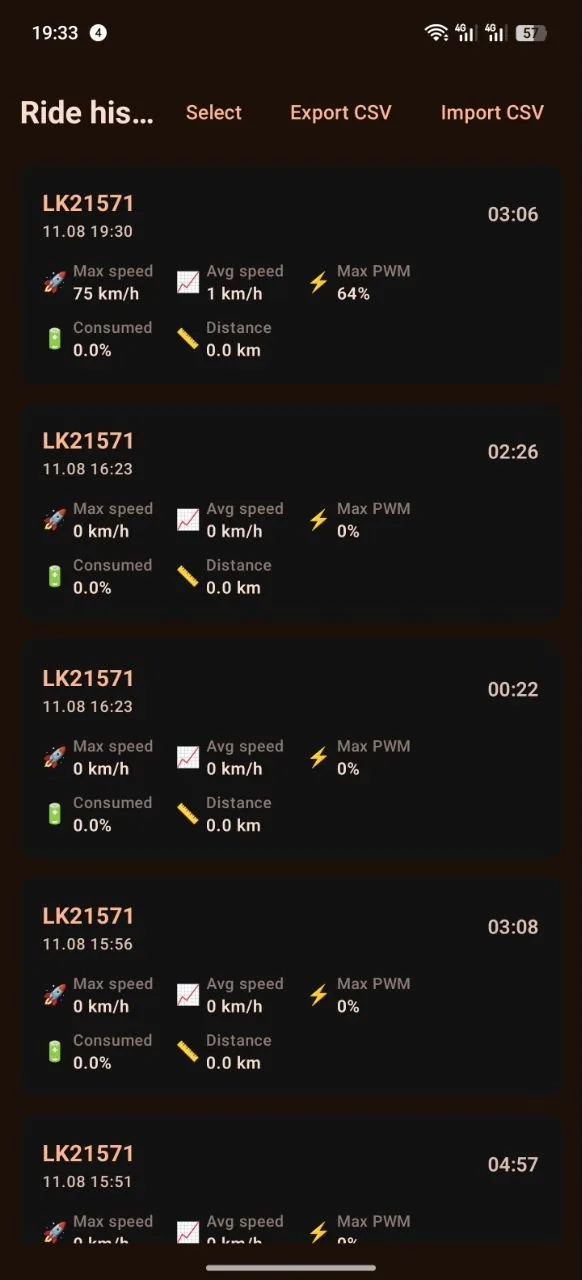
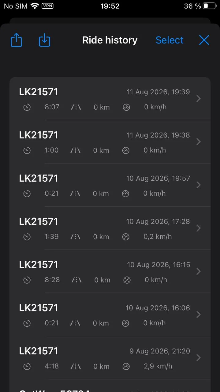
Ride history#
There are two ways in: from the wheel scanner — before you connect — and from the menu on the dashboard, under "Ride history". The second one is the one that matters: you spend the whole ride on the dashboard, and that is where comparing it with the last one comes up.
Every ride is a card with a thumbnail of its route: you recognise the shape of a track faster than you read a date. The card's headline is the distance; next to it sits a coloured dot if an alert threshold was crossed during the ride. The dot carries the same severity band as the dashboard instruments.
The distance comes from the wheel's trip counter, or from its odometer when there is no trip counter. A wheel that reports neither gets its distance from speed over time instead: a little coarser than a counter, but the ride no longer sits in the history at zero kilometres, and the consumption forecast can learn from it.
At the top, a summary: kilometres, time moving, ride count and top speed. With no wheel selected it covers the whole history; filtered to one wheel, the month of its latest ride. Rides are grouped by day, each day with its own total. Records shorter than three hundred metres — a connection in the car park, moving the wheel around — are folded into a single line and stay out of the way; tap it to unfold them. Diagnostic sessions show their StR field and sample counts rather than zeroes for speed.
Search at the top matches the wheel name and the date. When the history holds rides from more than one wheel, a row of their names appears above the list: tap one to keep only its rides, tap it again to clear the filter. With a single wheel the row is absent — there is nothing to choose between.
The name here is the one you gave the wheel in the garage. Rename it and the new name shows up in last year's records too: the name belongs to the wheel, not to that ride.
Several rides can be selected with a long press, then deleted at once or merged into one.
Heatmap#
The Heatmap button above the search puts the tracks of every ride on one map. The brighter a line, the more rides went along it; a dashed line marks a stretch where GPS dropped out for more than half a kilometre and the path in between is unknown. At the top you pick the period — all time, month or year — and, with several wheels, one of them. Fit shows every track at once.
The map is built on the phone from the recorded GPS points, with the same cleanup as a single ride's map, and is never uploaded. A deleted ride drops off it the next time it opens.
Locked rides#
When the wheel is your daily commute, most of the history is the same home-to-work track, and deleting those one by one gets old. It is easier the other way round: mark what is worth keeping and clear the rest with one button.
- Lock a ride on its own screen — the line with a padlock under the date — or several at once in selection mode with "Lock selected". The lock comes off the same way.
- A locked ride carries a padlock next to its distance in the list.
- "Delete unlocked" is the last item of the history menu. Before deleting, the app tells you how many rides will go, and deletes only once you confirm. The ride in progress and one that ended in the last few minutes — the app may still resume it after a reconnect — are never deleted, even when unlocked.
- For a few seconds after deleting, an "Undo" button stays at the bottom of the screen: it brings back everything that clean-up removed, telemetry and tracks included.
- A lock protects a ride from the bulk clean-up and from the retention period. You can still delete a locked ride by hand by selecting it.
- When rides are merged, a lock on any of the pieces carries over to the merged ride.
Losing the connection mid-ride#
A short dropout no longer needs merging by hand: reconnect to the same wheel within five minutes and the recording continues into the same ride by itself. In the history that is one row, one track and one consumption figure from start to finish, and time in motion counts from the real start rather than from the reconnection. Rides of different kinds — ordinary, from the watch, diagnostic — are never glued together.
The watt-hour counter on the dashboard does start over: it lives in the app's memory and a dropout clears it. The ride itself keeps the full figure, so look in the history rather than at the tile.
Merging rides#
One ride often lands in the history as several pieces: the wheel ran out and you swapped the battery, you stopped at a shop and the app was closed. Select those pieces in selection mode and choose Merge.
Telemetry and track move into the earliest of the selected rides, the rest disappear from the list. The distance adds up even if the wheel's trip counter reset between the pieces; battery used is measured from the start of the first piece to the end of the last. The gap between the pieces is not marked anywhere — from then on it is an ordinary ride, with its map, its share card and its exports.
Only rides recorded on the same wheel can be merged, only consecutive ones, and only finished ones: the ride being recorded right now is left alone. If an unselected ride sits between the selected ones, the app refuses — it would otherwise end up inside the merged ride, leaving two overlapping stretches in the history. Delete the ride in between and the merge becomes possible. Merging cannot be undone.
A single ride#
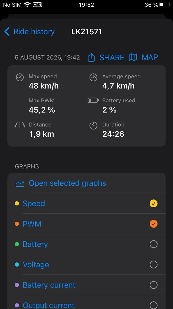
The track coloured by speed, six totals — top and average speed, peak PWM, battery used, consumption per kilometre and the odometer after the ride — the profile of the chosen readings, and a list of readings with their "minimum · average · maximum". Tapping a summary row opens the full chart of that reading; tapping the track opens the map.
Under the distance are the date and the ride time: the whole recording, from connecting to disconnecting, stops included. If the wheel stood noticeably with the recording on, the moving time sits next to it — only the time the wheel went faster than 1 km/h. Half an hour outside the front door then no longer turns 13 km in 25 minutes into 13 km in 52. On the dashboard the same moving time is a tile of its own.
Averages of riding readings count only the time on the move — the samples taken while the wheel was doing more than 1 km/h. That covers speed, PWM, currents, torque, power, the angles (pitch, roll, pedal angle), acceleration and field weakening: five minutes on the kickstand no longer turn the average pedal angle into −30°, and traffic lights no longer drag the average speed towards zero. Temperatures, voltage, cells and charge are averaged over the whole ride, stops included. Minimum and maximum always cover the whole ride. If the wheel never moved, the average takes every sample.
If you launched from a standstill to 60 or 100 km/h during the ride, the totals also show your best launch: "0–60 km/h — 4.3 s", "0–100 km/h — 9.8 s". From a standstill means the wheel had stood still for at least a second first. The time uses the speed you saw on the dashboard, so your speedometer correction is included, and it is given to a tenth of a second. If you thinned out recording in the settings, launches are not timed: with sparse recording the time would be a guess. This number is just for you; nothing checks it.
On a short ride the battery used is shown with a tilde: "≈0.4 %". The wheel reports charge in whole percent, and over a couple of kilometres the honest answer is not "0 %" but an estimate from voltage. The tilde is what says "worked out from voltage rather than read off the wheel".
The slider under the charts sets the viewing window: a five-hour ride in full is one solid block, while inside a window every acceleration is visible. The window is shared between the ride screen and the charts screen: go into the charts and come back, and it is still where you left it.
On iPhone you can swipe between records straight from this screen: left for the next one, right for the previous. It pages through exactly what you saw in the list — your search and the collapsed short records included — and does nothing at either end of it. A drag from the very left edge still means "back": the gesture does not take it away.
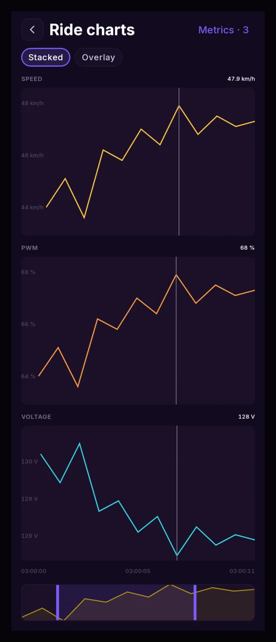
The "Metrics" button opens the full list of readings recorded during the ride, with sparklines — the shape of the curve is visible before you open anything. The chart icon on a row adds the reading to the charts screen and takes it off again. The charts are not limited to speed and PWM: any recorded reading can go onto a track.
A reading's full chart prints the number as the wheel sent it: voltage with hundredths, "150.94 V", on 134 V and 151 V wheels too. The ride screen and the dashboard make do with tenths; this is where you come for the exact value. If you have set your own precision in the settings, the chart follows it.
Going back from the chart, as from any other screen, puts you where you were: the list of readings stays scrolled to the row you left from.
Ride analysis#
Under the map on the ride screen there is a "Ride analysis" button. It opens a separate screen that answers not "how much", as the ride totals do, but "how".
Every ride has an analysis — including rides recorded long before the analysis existed in the app. It is worked out from telemetry that is already stored, and nothing needs to "start collecting".
Load#
The headline number is peak PWM. Under it is a bar that carries three values at once: the fill is the usual working PWM (the wheel rode above it only a twentieth of the time), the white caret is the peak, and the hatched zone on the right is above 70%. The line under the bar says the same in words: "Usually up to 60% · above 70% for 1% of riding time". A peak can be a single spike on a kerb, and next to the working PWM that is obvious at a glance.
Load is measured on two channels. Besides the share of time above 70% PWM, the share of time above 70% of the wheel's own current limit is shown — when the wheel reports that limit. Duty cycle and current run into different walls, and a wheel can reach one without coming near the other. Below are the peaks of power, current and phase current, and the controller temperature.
Riding#
Three rows: smoothness, acceleration and braking. Each has a measured number — for example "5.8 km/h/s" — and a bar. There are no scores here: sharp riding is a style, not a mistake, and the app describes how you rode rather than grading it.
The smoothness bar is longer the smoother the ride. The acceleration and braking bars are longer the sharper it was. A line under the block says so.
Acceleration and braking are measured separately. Anyone can brake hard; accelerating hard is a question about the wheel's headroom, and one shared "sharpness" would blend two different answers.
The bars are not coloured. In this app colour means "a threshold was crossed", and riding style crosses no threshold.
Everything is computed so that the wheel's reporting rate does not affect the result. The same riding recorded from a wheel that reports five times a second and from one that reports thirty gives the same numbers.
Comparison with other rides#
The bars get a "usual" notch — the median of your other rides on this wheel. Under the block is one line about the most noticeable difference, for example: "Sharper acceleration than usual: sharper than in 30 of 37 rides on this wheel". A position, not a percentage — you can check it by opening the history.
Differences under 4% are not named at all — that is roughly what a different road does to the same riding style.
A comparison needs at least four other rides over 1.5 km on this wheel — before this ride or after it. Up to sixty are used, the nearest in time: style changes, and a ride is described by its neighbours. Deleted rides and diagnostic sessions are left out.
The "usual" notch moves over time — the median is recomputed with every new ride. The measured numbers of the ride itself never change.
How far to trust the analysis#
If more than a fifth of the riding was not recorded — the app kept losing the wheel — a frame appears above the analysis: "Part of the ride was not recorded", with how much was. The figures below are then approximate. A good recording says nothing.
A stop is not a loss. If the link dropped while the wheel stood still — or was switched off outside a café — and the wheel's odometer did not move in the meantime, the analysis is not affected.
GPS does not affect the analysis: the distance and every number come from the wheel's speed, so a ride with no track is analysed in full. If GPS reception was poor, a line under the map on the ride screen says so.
Short rides#
A ride shorter than 90 seconds or 300 metres gets no riding style: on a stretch like that it is one manoeuvre, not a style. The screen says so instead of showing random numbers.
Charts#
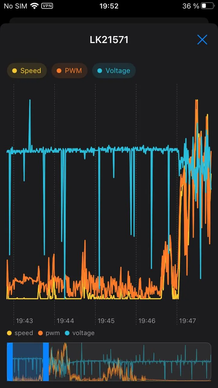
By default the readings are stacked as separate tracks, each with its own scale and its own labels. Overlaying them on one axis stays as the second mode: it is the right one for readings of the same nature. In the overlay the colour belongs to a family of readings — every temperature is red — so each line there gets its own stroke pattern: solid, dashed, dotted, dash-dotted. The same piece of line sits in the legend in front of the name, so the controller, motor and MOSFET temperatures can now be told apart on the chart. The cursor runs through every track at once, and each track's header shows its value at that point. Alert thresholds are drawn in the same strokes as on the dashboard.
- Pinch to zoom, centred where your fingers are.
- Drag with two fingers to pan the zoomed window.
- The vertical scale stays put while you do: it is built from the whole ride, not from the stretch on screen. A calm stretch and a sprint are drawn on the same scale, so you can compare how much a reading swings by eye. The live dashboard tiles still fit their scale to recent values.
- Where the recording stopped — a lost connection, the pause between the pieces of a merged ride — the line breaks rather than running straight across the emptiness. The map track and the elevation profile do the same: the straight line between pieces counts as neither distance ridden nor height climbed.
Launch timer#
Besides the best launch in the ride totals there is a timer on request: dashboard menu → "Launch timer". While the screen is open, the app waits for a standing start and times 0–60 and 0–100 km/h.
- Stop. Once the wheel has stood still for a second, the screen and the voice say "Go".
- Launch. The screen shows a large stopwatch, speed and PWM — PWM is coloured by your alert thresholds, like the dashboard tile. One beep at 60 km/h, two at 100. If an alert is sounding at that moment, the mark beep gives way to it.
- After the run the time is spoken and stays on screen. "Again" starts a new attempt.
The attempt is discarded if the wheel stops or slows down before 60, if 60 takes more than a minute, or if the wheel link drops. If 60 was reached but 100 was not, the run is kept with the 0–60 time only.
The time uses the speed on the dashboard, with your speedometer correction, to a tenth of a second. Each run says whether GPS was there all the way: a fix every second, better than 10 m, and no faked location. During the timer GPS switches to a fix every second by itself, and if route recording is off it is turned on and off again when you leave the screen. Those fixes do not go into the ride's route.
Runs are kept on the phone, listed per wheel with the best time on top; any run can be deleted. The timer does not work in demo mode or on a recording: their speed was never ridden.
Route recording and the map#
Turn on route recording and the app logs your position while a ride is active. Afterwards the route can be viewed on the map. The app also builds an elevation profile from the track.
Route recording needs permission for precise location. Without it everything else works as usual, there is simply no track.
The map answers "where was it hot", not "where did I go". The base map is deliberately dimmed: on a screen for going through a ride, the track is the only bright thing on it.
Where the base map comes from#
The tiles come from CARTO, and since 2026 they are served against a key: without one the server returns the same picture with "API KEY REQUIRED" written across every square. It answers as if nothing were wrong, so the app checks the base map itself — once an hour it downloads one deliberately empty square and weighs it. A marked one is almost twenty times heavier than a clean one.
If the probe finds the notice, the map moves to its fallback — Esri Gray Canvas, just as dimmed and also free. It has its own zoom ceiling of z16: it is not detailed any closer, and the map stops honestly at that limit rather than showing you nothing.
Settings, Map & GPS lets you pick the base map by hand: Auto, CARTO or Esri. "Auto" is the probe described above; the other two overrule it.
Who moves the map#
Zoom with a pinch, or with the "+" and "−" buttons in the corner of the map. Below them sits "fit track", which brings the camera back so the whole route fits on the screen.
On its own the map frames the track exactly once — when the track first appears. After that it is yours: the route keeps growing during a ride, but the camera stays where your hand left it and never jumps back. That button brings it back to the track.
The track is coloured by a reading#
The track carries a reading by colour, and that colour reads exactly the way the dashboard reads: the hue tells you which reading it is, and the saturation tells you how loaded the stretch was. Quiet stretches sink into the ground, loaded ones lift off it.
The colour scale is stretched over the ride itself. The reason is plain: the limit is your threshold — say 62 km/h — while a town ride runs at 20–44, that is, in the middle third of the scale. Stretched over the ride, it shows the difference between "ambling" and "pressing on" where you actually rode. One consequence is worth knowing: colours are comparable within a ride, but not between rides. "It was hotter here than there" — yes; "this ride was hotter than the last one" — that is what the history and the charts are for.
A perfectly flat recording — standing in traffic — is not stretched: it has no shape, and blowing noise up to the full scale would be drawing the weather instead of the riding.
The threshold itself stays put. Where the reading went past it, the track switches to the colour of the severity — the same one a tile's border uses on the dashboard to report a breach. Red on the track means exactly one thing: your threshold fired. It never means "fast": with no speed alert set, the quickest stretch of the ride comes out bright, not red.
Breaks in the recording break the track rather than running a straight line across the emptiness: between the pieces of a merged ride the wheel was somewhere unknown. And where the position was logged but no telemetry arrived at that moment, the route stays visible as a dark thread — without colour, but without a hole either.
What one point of the track stands for#
The track is laid out by the seconds of the ride, not by satellite fixes. The difference shows most where the sky is poor: fixes arrive every couple of seconds, and under bridges or between buildings once every hundred metres — a stretch like that used to be a single colour all the way through, because the instrument had no point inside it at all. Now it has as many as the seconds you spent riding it.
They are placed by the wheel's odometer rather than spread evenly over time. The odometer does not depend on the sky and knows how far you had gone by each second, so where you braked the points sit closer together. A place on the map and a moment in the recording finally mean the same thing: what you tapped is what you are shown. Wheels that do not report distance behave exactly as before — laid out by time.
The colour of each point is the worst of its second, not the value at its exact mark. Telemetry is written many times a second, and a PWM dip lasting a third of one used to fall between points and colour nothing. That is why the readout line says "in that second": what stands under it is that second's peak — the very one the stretch is coloured with.
The second reading — by thickness#
One line cannot carry two hues: the hue is the name of the reading. So the track carries a second reading by thickness instead: a quiet stretch is a thin strand, a loaded one is a line at full width. Speed by colour and PWM by thickness answer two questions at once without painting the route twice.
Thickness takes its load from its own scale, stretched over the same ride — and at the limit the core covers the casing completely.
Marks#
- Start is a ring, finish is a filled dot. Both are always there, and between them you can see which way the ride ran.
- The peak of every chosen reading gets a mark of its own, with the value next to it: the peak for everything that grows towards danger, the minimum for charge and voltages. The reading that colours the track is labelled with the word "Peak" and a large number; the others get a number with its unit in their own hue. The labels carry no plates, so they do not cover the thing you opened the map for, and they spread out so as not to sit on top of each other. A peak at the edge of the map is labelled straight away: the label shifts inwards instead of waiting for you to pan. Where a label finds no room, the ring stays — the number is in the lane under the map anyway.
The lanes under the map#
Under the map sits the same track, straightened out along the distance ridden: one lane per chosen reading, all on one axis and under one cursor. That shows what a folded route cannot: where PWM jumped while the speed stayed calm, where the motor kept heating longer than the climb lasted.
What a reading does is visible from how its lane is drawn: a colour fill means it colours the track, height bars mean it thickens the track, a thin fill means it is not drawn on the map at all — but its peak is marked and its shape is here. The name is on the left, the value on the right: at the cursor when you have one, the extreme for the ride when you do not.
The lanes do three jobs the map cannot.
- It is the legend. A coloured squiggle on a map cannot have one. Straightened out, it reads at a glance: which colour is calm, which is dense, and in what order they came during the ride.
- It is what you drag. Hitting a folded track with a finger is painful; running along the ribbon is not. The cursor on the ribbon and the point on the map are the same place, and either one can lead. Both pick the spot under your finger rather than the nearest satellite fix: fixes land every couple of seconds, some twenty metres apart, and the readings come from the ride recording — which runs independently of the sky and is there even where no fix is. A tap that misses the track clears the selection.
- It shows every breach at once. On the map they hide behind the folds of the route; on the lane they stand in a row as notches along the top edge. How many times a threshold fired during the ride, and where, takes one look.
Below the lanes runs the distance axis: zero, halfway, total kilometres. The line above them holds the two leading readings — the one colouring the track and the one thickening it — plus the time and the distance ridden at the chosen point.
Choosing the readings#
A row of chips at the bottom of the screen lists the readings recorded during this ride. A chip has four states, and a tap walks the reading around the circle:
- off — tap, and it appears as a lane under the map;
- lane — tap again, and it colours the track;
- colour — tap again, and it moves to thickness while the previous one takes the colour;
- thickness — tap again, and it switches off.
No more than four readings at a time: a fifth lane takes height away from the map, and the eye compares four curves anyway, not six. At the ceiling the free chips dim — tapping a dimmed one puts it in place of the last lane.
Speed by colour and PWM by thickness are the defaults. The choice is remembered between visits to the screen, but it does not carry from one ride to the next: it belongs to whatever you are looking into right now.
Ride card#
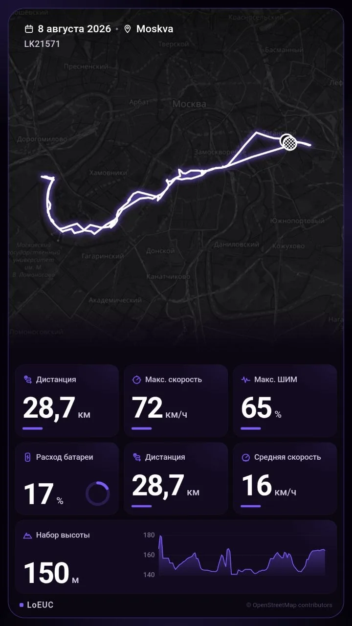
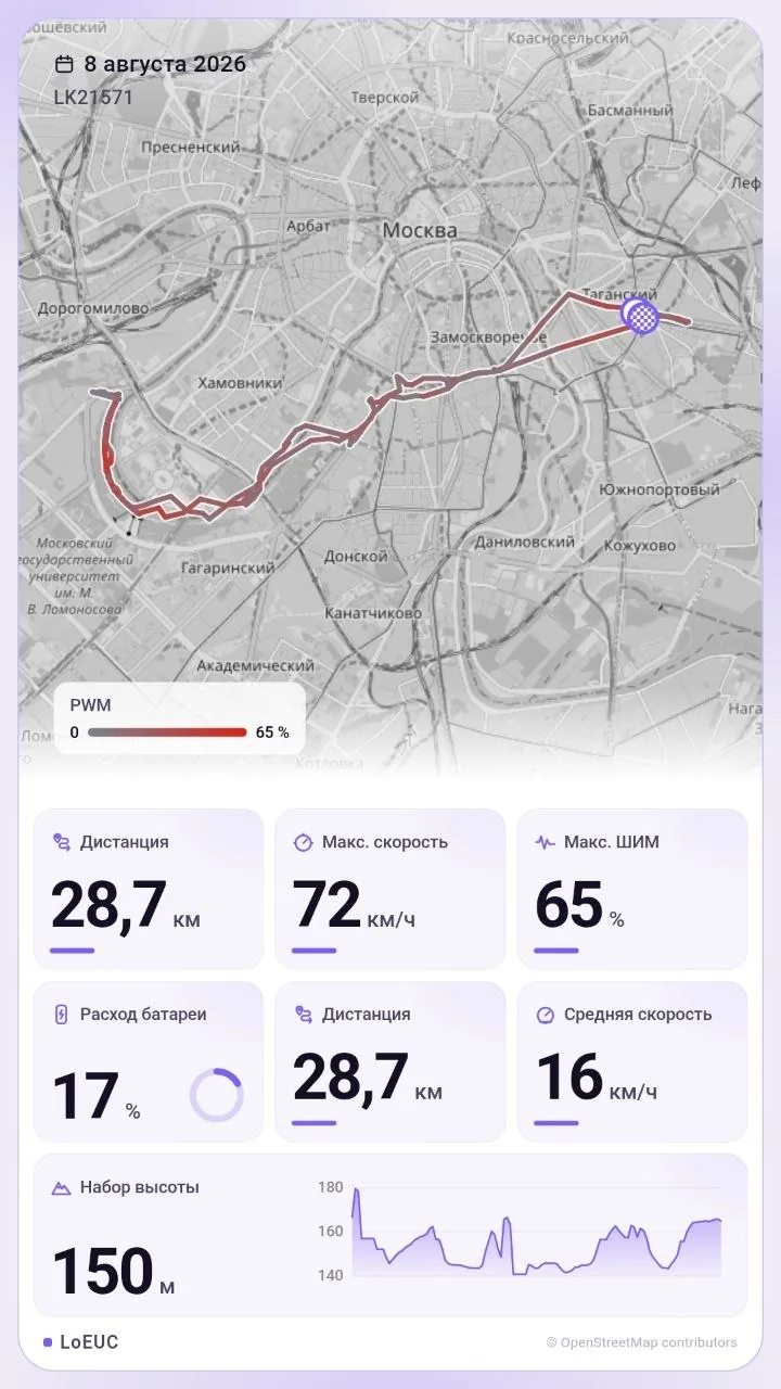
Any ride can be turned into an image to send to friends. The card carries the route, the date, distance, ride time, top and average speed, peak PWM and battery used.
Most of it is adjustable: theme, accent colour, colouring the track by a reading of your choice, and which tiles appear. Tapping a tile swaps it for another reading from the same ride.
Two tiles can come from the ride analysis: smoothness — a 0–100 score with a ring — and riding above 70% PWM — the share of time under load. Two, not all four riding scores: four scores on a picture for friends turn it into a school report. Smoothness reads as pride without boasting, and the share under load says something about the route rather than the person. The default card does not change — these tiles appear only if you pick them yourself.
How much space it takes#
You decide how detailed the recording is.
- Recording rate: every frame, or every second, third and so on. The default is every frame — short events such as the wheel pitching nose-down last a fraction of a second, and a sparse recording loses them. The app shows how many snapshots and roughly how many megabytes that works out to per hour of riding.
- Retention: starting a new ride evicts rides older than the period you choose. While there are no new rides, nothing is touched. Locked rides are never evicted.
Frames that set a new record for the ride in speed, PWM or current are always written, whatever rate you picked. Otherwise a sparse recording would drop exactly the moments people open the charts for.
Beyond what the screen shows, a LeaperKim ride also records speed and phase current with their sign: the dashboard shows them as magnitudes, but reconstructing a fall needs to know whether the wheel was rolling backwards and whether the motor was driving or braking. These values are in the all-rides export; the ride screens do not show them.
Export and import#
- Every ride, telemetry sample and route point exports to a single spreadsheet file and imports back. This is how you move history to a new phone, or between Android and iPhone.
- Importing does not create duplicates: rides and samples are matched on stable keys.
- A ride's lock travels with it: on a new phone "Delete unlocked" keeps what you kept on the old one. Files exported before locks existed import as before, with their rides unlocked. An import can lock a ride already in your history, but never unlocks one.
- A single ride's track exports as GPX, which third-party maps and sports apps understand.
- A single ride also exports in WheelLog's format — "Export Wheellog". That is the spreadsheet file euc.world imports and the ride analyses riders pass around expect, carrying both the telemetry and the route. A ride recorded without location access exports too; its coordinate columns simply come out empty.
- A single ride also exports in the app's own format — "LoEUC archive". GPX drops the telemetry, WheelLog drops everything its columns have no room for; this archive is what our own import reads, so the ride moves to another phone whole, along with the summary the charge forecast is built from. The same archive exports the rides you have ticked — "Export selected" in selection mode; deleting the selected rides sits next to it, and it asks before it deletes.
- Export and import show a progress window: how many rides of how many have moved. It can be cancelled. Cancelling stops at a ride boundary, so the history only ever holds whole rides — never a half of one. Importing the same file again brings the rest across; it creates no duplicates.
Dump player#
The app can record the raw conversation with the wheel and then replay it as a live ride, with seeking and fast-forward. The dashboard, the charts and the alerts behave exactly as they would with a real wheel, and nothing is written to the ride database.
This is the main tool when something about a wheel needs explaining or a new model needs support: send me the recording and I see exactly what your app saw.
Track privacy#
Settings, Map & GPS.
The start and the end of a ride are almost always your own yard, and an exported track shows it down to the doorway. Hide the ends of the track sets a radius that never leaves the phone: points closer than that to the first and the last fix are cut out.
What gets cut is what goes to other people: GPX, the WheelLog export and the ride card. What stays yours is not cut: the in-app map and the LoEUC archive. The archive is how you move to a new phone, and trimming your own data there would erase it for good.
The radius is measured from the ends of the track itself, not from your home — the app does not know where you live. So on a very short ride the radius may eat the whole track, and that is an honest answer: a ride from one doorway to the next has no safe middle.
Off by default.